I spent the weekend in New York City in February, battling a cold and attending the Versions 2017 conference at the New Museum. Hats off to Julia Kaganskiy and the crew that assembled such an impressive array of speakers working in VR. I’ll recap that event another time, because I’ve been thinking about something else that happened on that trip.

While we were there, we went to the Pierre Chareau exhibition at the Jewish Museum. It’s a small show, comprised mainly of furniture pieces designed by the French architect/interior designer. While I went there specifically to see how they used VR headsets in the exhibition, I was more intrigued by some of the presentation choices made by the exhibition designers and how they do (or don’t) increase visitors’ appreciation of the topic.
Hide and seek
Chareau was a hard show to navigate. I never once felt that I’d built a mental map of the layout, even after I’d finished. It was an intentional choice, too. The exhibition is a typical black box space, and the designers used hanging white curved partitions that look like photographers’ cycs to frame many of the furniture objects, and block your view of them as you walk through the gallery. On the backs of these are projections of silhouettes of people engaging in everyday domestic activities; a woman brushing her hair at a mirror, a man writing at a desk. When you get to the other side of the partition, you can see the actual furniture and (hopefully) realize that it is the same as the objects in the “shadows”. The shadow effect bugged me a bit at first, since they aren’t really shadows; the walls are solid and opaque. Since it’s hard to see the projection and the actual furniture at the same time, it took me a couple of times to confirm that it was actually corresponding to the specific objects on the other side, and not just being evocative. The “shadow” effect grew on me, though, since it injected a human presence into what could have been a very clinical, impersonal space. The maze-like quality never grew on me.
Embracing the theatrical
I did appreciate the outright theatricality of the design. It reminded me of wandering around through Sleep No More in some ways. The museum did a good job of concealing and revealing just enough to lead me through the space and get me to recognize that there was something on the other side of every wall, know a tiny bit about it, and still have a little “aha” moment when I got to each display. I wrote about embracing theatricality in exhibitions earlier as part of a series of posts on making a museum from scratch, and this was an effective demonstration.
Guarding the magic
I was in town for a virtual reality conference, and VR was why I was at the Jewish Museum. I’ve been interested in finding examples of VR implementations that line up with reality and don’t just discard it in favor of virtuality, and here I thought the Chareau exhibition really delivered. While I’m on the fence about the exhibition as whole, the VR exhibit really embodied the spirit of one of my favorite manifestos on making exhibitions, the Medical Museion in Copenhagen’s “A manifesto for creating science, technology and medicine exhibitions“. I’ve recommended it before and I’ll do so again, and despite the title, I believe the philosophy espoused within it is broadly applicable to museums of all stripes. Thesis 6 of the manifesto is titled, “Jealously guard a place for mystery and wonder” and suggests that we deliberately “…include some exhibits about which less, rather than more, is known – curious exhibits that just cannot completely be accounted for.”
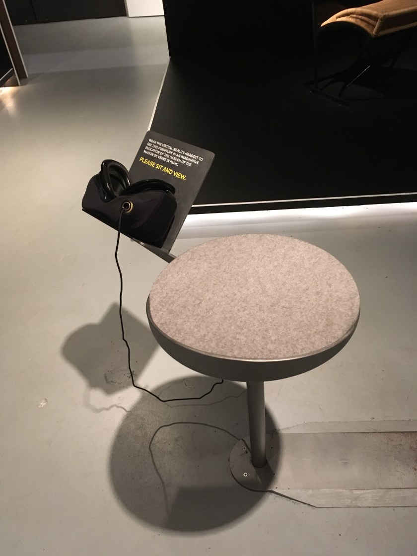
In the center of the gallery there were four vignettes of furniture from Chareau houses, in a typically Modernist setting; monotone and empty. In front of each vignette was a stool with an attached shelf, holding a Samsung headset and a long cord. When you held up the headset and looked through it, you got magic. The same furniture in front of you was there, in the same orientation, but around it was an “evocation” (museum jargon for “We couldn’t be completely certain that this is 100% exactly the way it looked”) of the interior of the house the furniture was made to go in. This is an issue we often deal with; how close to complete fidelity do you have to get in order for something to be “museum quality”? I was glad the Jewish Museum opted to go for it and build a believable, complete VR environment. Carpets on floors, bookcases full of books, afternoon sun pouring in through banks of windows. Quite a change from a dark room on the Upper East Side!
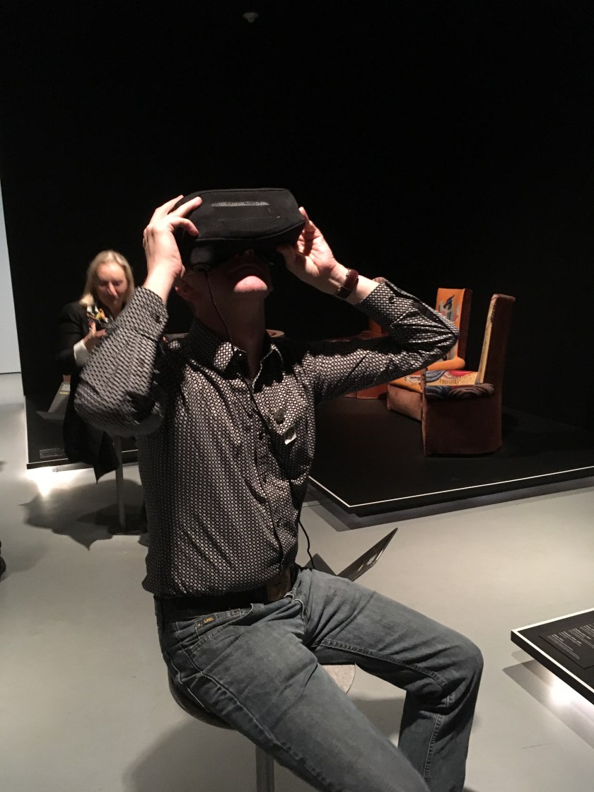
Of course, you weren’t seeing the actual furniture, you were seeing extremely high-fidelity 3D models of that furniture in a computer model of a space, but the designers went to the trouble of making sure both sets of furniture were in the same orientation, and that if you were facing the furniture, the virtual furniture was in the center of the field of view in your headset. I saw a couple of different visitors look at the furniture, look into the headset, then look back at the furniture and back at the headset before doing the usual dance of people in a VR environment, lazily spinning and looking all around. The VR augmented the physical furniture without supplanting it, and the experience provided visitors with a tasty snack, a peek into another context that wasn’t weighted down with explanations or demonstrations.
We had talked about doing the same kind of experience for our upcoming Ocean Liners exhibition, but abandoned the idea because of the low throughput of these kinds of headset experiences. In a small, quiet gallery it’s one thing. In a 10,000 square foot exhibition with hundreds of objects, and (hopefully) many thousands of visitors, it would be a bottleneck.
When showing isn’t telling
After the pleasure of using good VR, I was excited to learn more about Maison de Verre (The Glass House), Chareau’s most famous work. The sign on the door to an adjacent space told me that this house was unique in ways that traditional architectural models couldn’t convey. I entered, not knowing what that meant, other than I probably wasn’t going to see a physical model of the house, but something much, much cooler.
What I saw was a projection screen displaying an elevation of a house hanging in the center of the space over a floorplan and a video of a woman opening a closet playing on one wall of the space. As I tried to figure out what I should be looking at I noticed several things. The projection screen was moving towards me with an ominous jerky, creaking, sound. As it moved, a laser line on the floorpan moved as well. It dawned on me that I was seeing a cross section of the house at the position of the laser line on the floorpan. Indeed a room on the screen highlighted and a new video popped up on the opposite wall of a man looking for a book. This continued for several minutes, with the screen lurching slowly backwards and forwards, pausing and playing a video of languorous French people moving around in side a space that “evoked” the Maison de Verre.
What didn’t work for me
I spend a fair bit of time looking at floorpans and elevations for work, so I have learned how to read them, but even with that experience it took me an unacceptably long time to realize that what I was seeing on the projection screen was essentially a CT scan through the middle of Maison de Verre. And having looked at my share of CT scans, I can confidently say that they are a tough form of visualization to get accustomed to. And I was better off than most of the people in the room with me at the time. Most people ignored the screen and the floorpan and waited patiently for the next video to appear. Which is a shame, since so much effort obviously went into building a high-fidelity 3D model of the house. It was visually pleasing to watch the building on the projection screen disappear as the vantage point shifted, but I didn’t get any sense of how the building was architecturally different, and certainly no sense of how the whole series of spaces connected and flowed into each other. I felt like I’d been promised a revelation and given a cipher instead.
As we were leaving the gallery I found the sign that told me that Diller, Scofidio, and Renfro designed the exhibition, which answered a lot of my nagging questions. I could easily see how an architecture firm could think that the public would “get” a confusing architectural way of looking at a domestic space. DSR also designed the Charles James exhibition at the Met, which had the dubious honor of being the last exhibition to actually make me mad at the designers. If you didn’t see it, it’s hard to explain, but it involved ball dresses and cameras on robot arms that supposedly gave you close up views of the dresses, but really just played canned video loops as the arms waved around the space like Ballet Robotique.
It was a fascinating show, and I was glad to have seen it. It’s one of the best uses of virtual reality in an exhibition I’ve seen, and the design choices made on the whole made what could have been a fairly dry examination of the subject an evocative, and, yes, immersive one at that.
